Design samples
Screens, drawn before they are built
Ten product studies, each with its own palette, type pairing and medium — hand sketch under crisp UI, dark data surfaces, blueprint annotation, pastel calm, frosted photography. Below them: the line-drawn studies and token boards the screens were assembled from.
01 — Mobile app studies — five projects
Five product briefs, three screens each: Rambutan, Mangosteen, Feijoa, Cherimoya and Kiwano. Each one gets its own palette, its own type pairing and its own medium — risograph print, soft pastel, warm sunset, warm dark, frosted photography — because a portfolio should show range, not one house style.
Rambutan
WIPSocial video · Risograph print / paper collage · In progress
Two-ink risograph on warm stock — teal and tomato, halftone dots, cut-paper cards. A social app that behaves like a printed zine.
Open working prototype →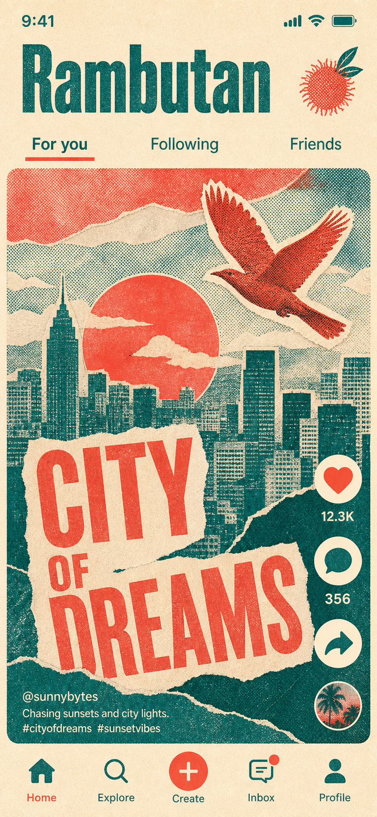
Feed
Posters, not tiles: one story owns the screen at a time.
Risograph print / paper collage · Riso teal + tomato · Phone frame · 9:19.5
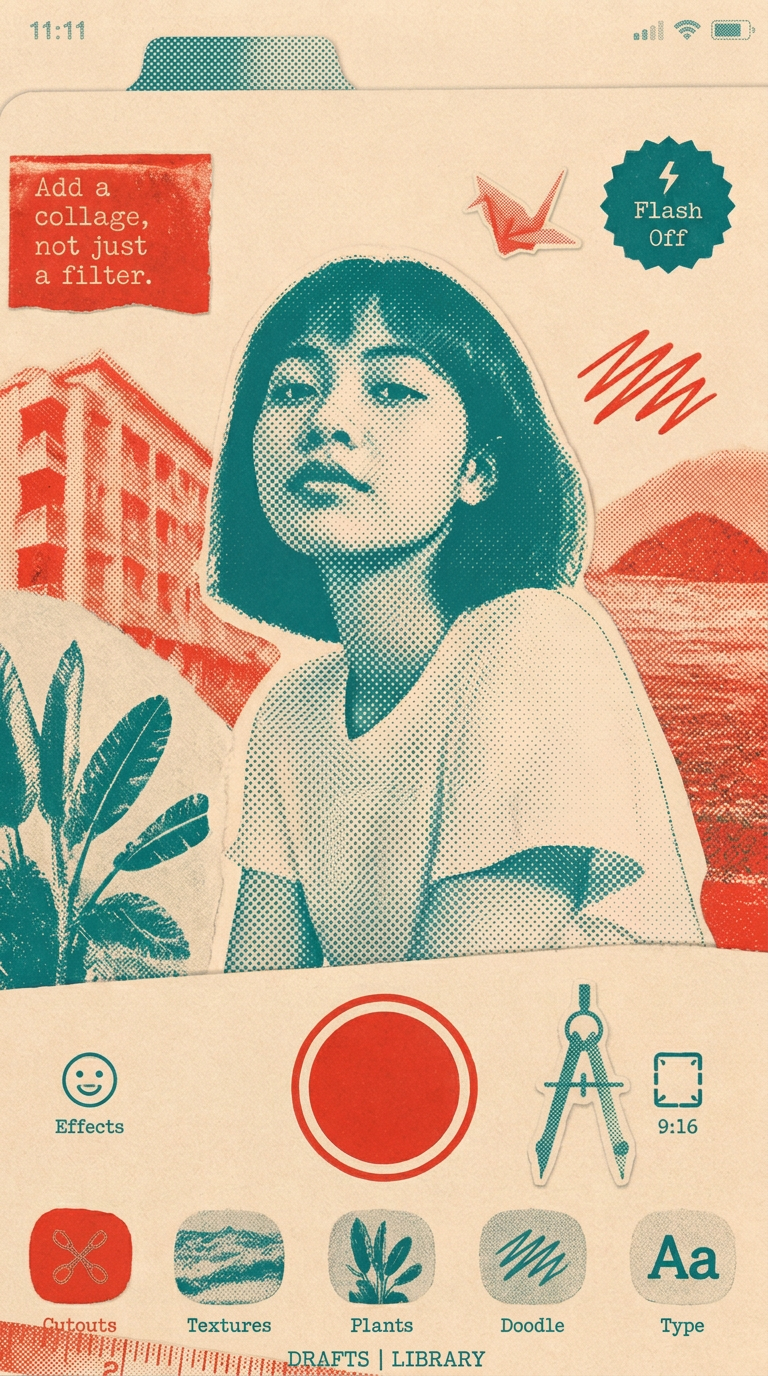
Create
One primary gesture; the collage tools sit a thumb away.
Risograph print / paper collage · Riso teal + tomato · Phone frame · 9:19.5
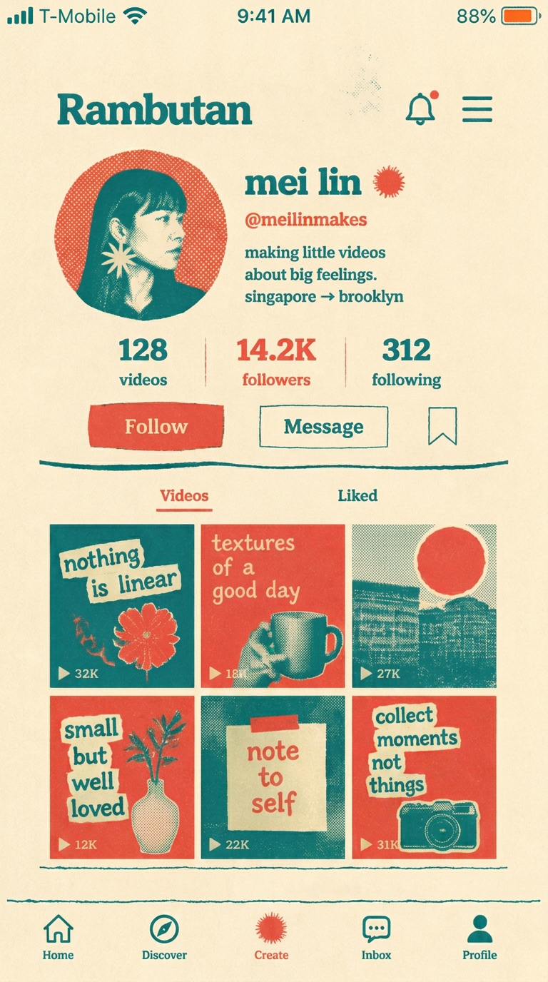
Profile
Identity first, numbers second, work last and largest.
Risograph print / paper collage · Riso teal + tomato · Phone frame · 9:19.5
Mangosteen
Wellbeing · Soft pastel / rounded cards
Calm as a constraint: mint and lilac washes, oversized rounded cards, nothing that raises a pulse.
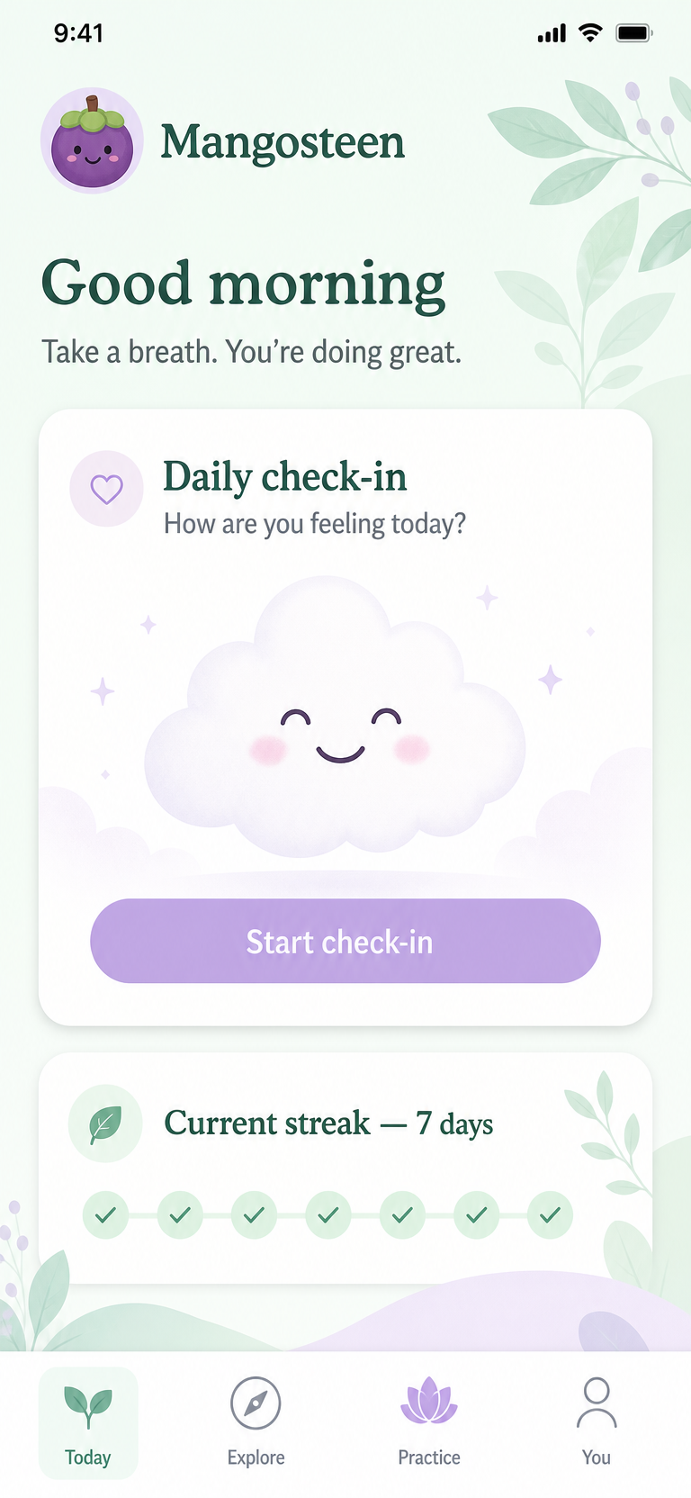
Today
One check-in, one gentle prompt.
Soft pastel / rounded cards · Mint + lilac · Phone frame · 9:19.5
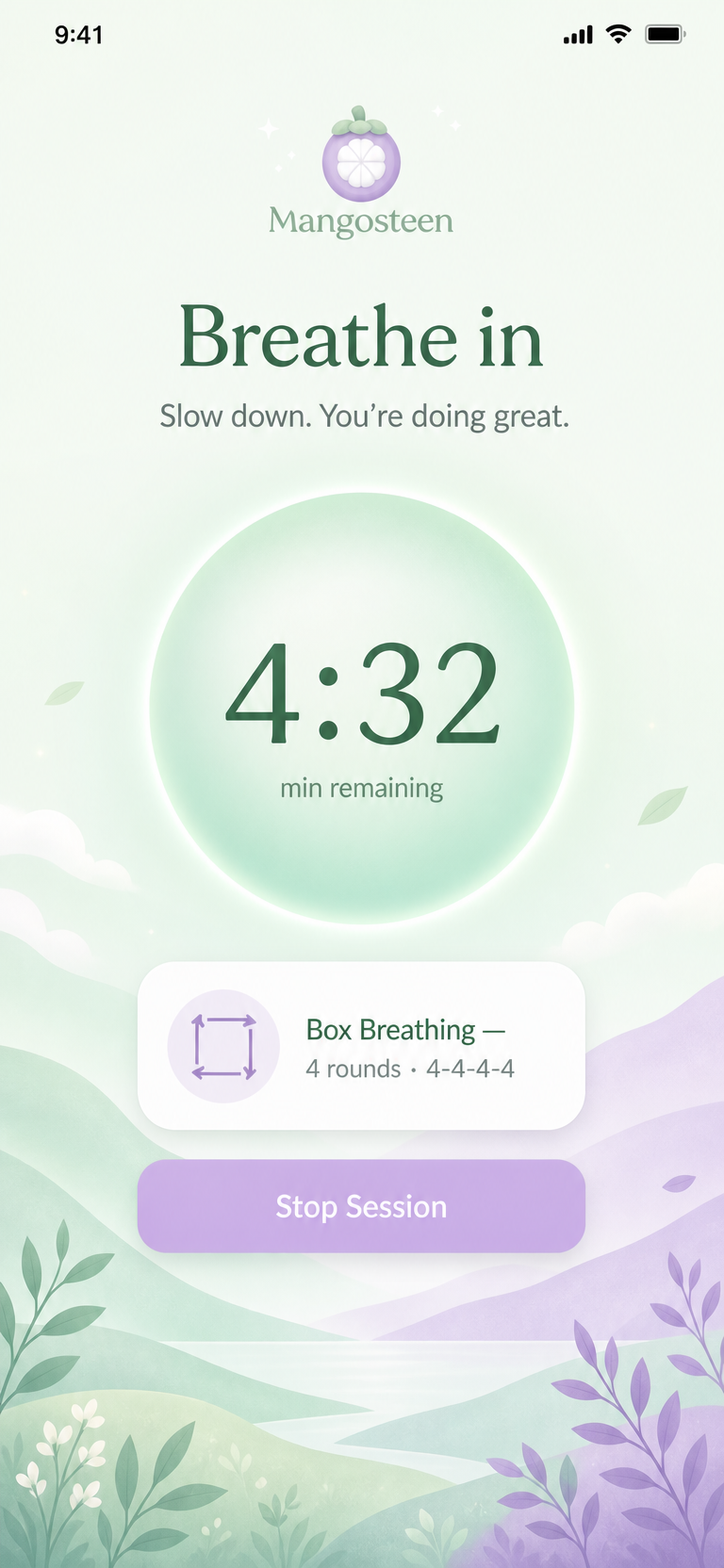
Session
The screen goes quiet while the person is busy.
Soft pastel / rounded cards · Mint + lilac · Phone frame · 9:19.5
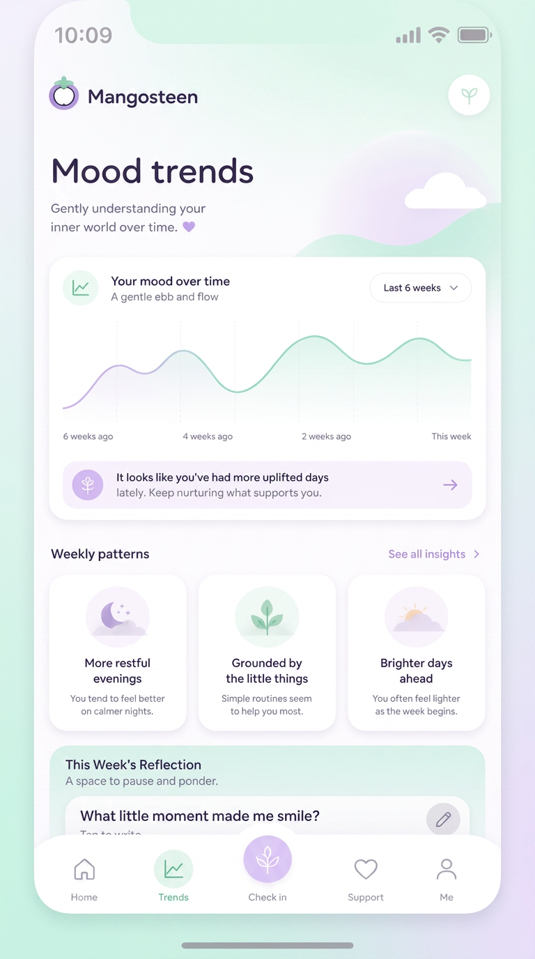
Trends
Patterns, not scores — no one gets graded.
Soft pastel / rounded cards · Mint + lilac · Phone frame · 9:19.5
Feijoa
Local discovery · Sunset gradient / cream cards
Coral-to-amber warmth over cream: a discovery app that feels like early evening in a city you half know.
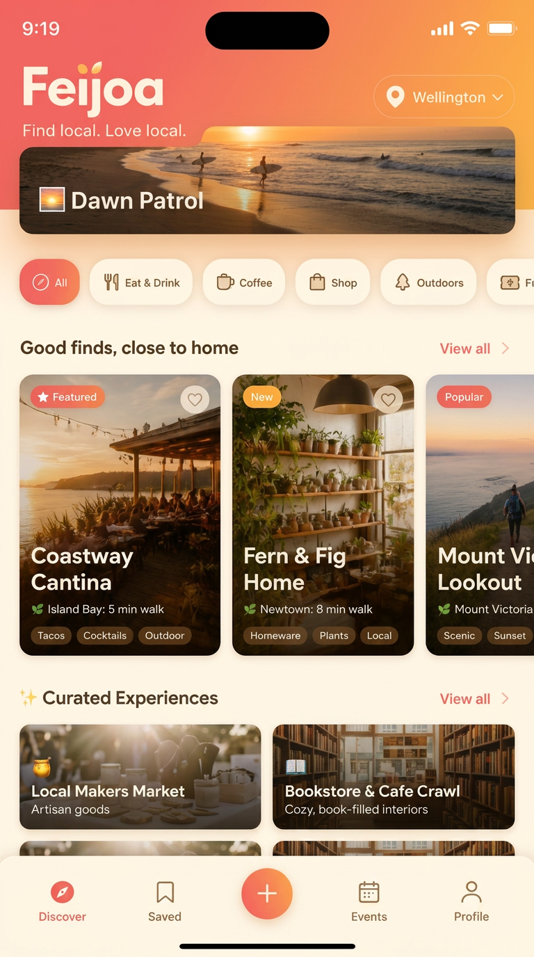
Discover
Editorial cards over a list — browsing is the point.
Sunset gradient / cream cards · Coral sunset · Phone frame · 9:19.5
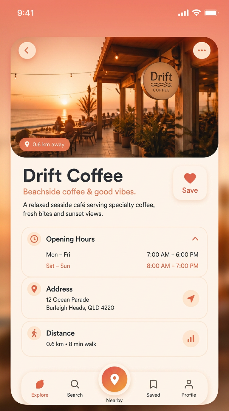
Place
Photo, hours, distance — the three things people check.
Sunset gradient / cream cards · Coral sunset · Phone frame · 9:19.5
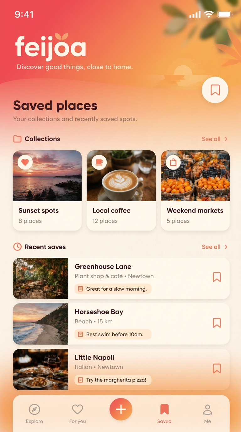
Saved
Collections, because saving without sorting is losing.
Sunset gradient / cream cards · Coral sunset · Phone frame · 9:19.5
Cherimoya
WIPAI creative tool · Warm dark / amber light · In progress
Clay-brown near-black with amber light instead of neon: a quiet dark tool where the generated work is the only bright thing.
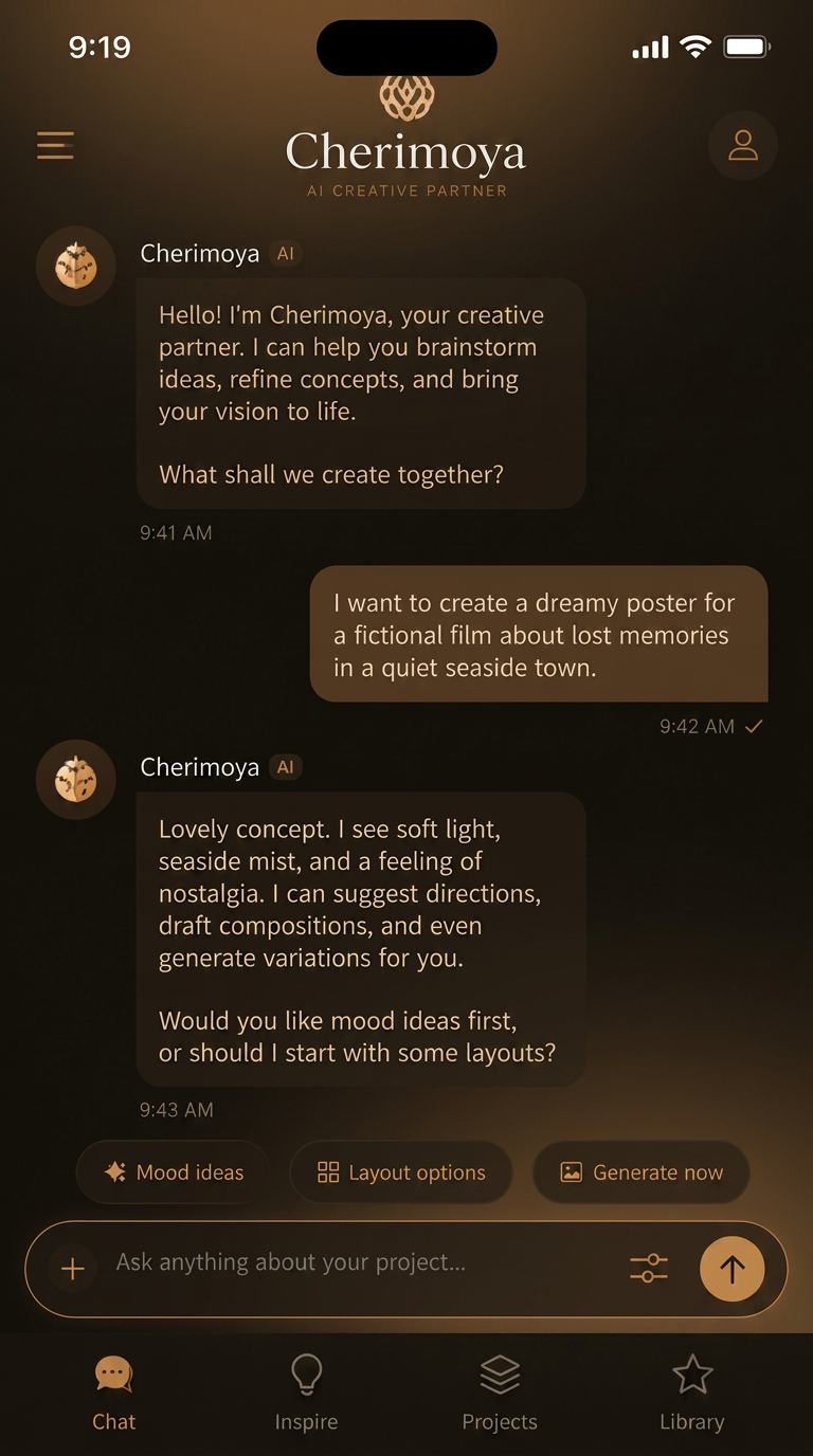
Assist
A conversation, not a form — the prompt stays the interface.
Warm dark / amber light · Amber on clay dark · Phone frame · 9:19.5
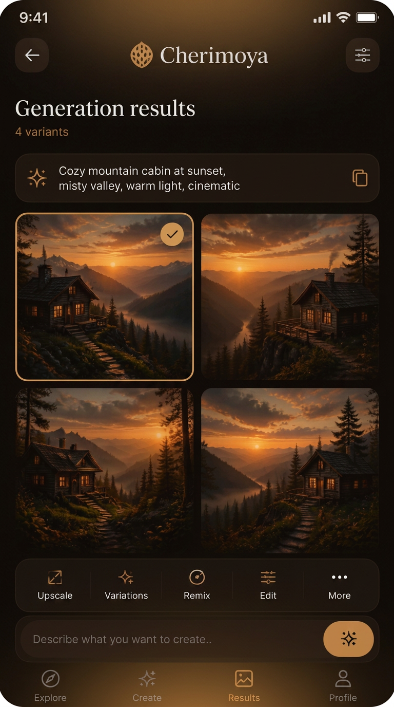
Results
Four variants side by side, so choosing is comparing.
Warm dark / amber light · Amber on clay dark · Phone frame · 9:19.5
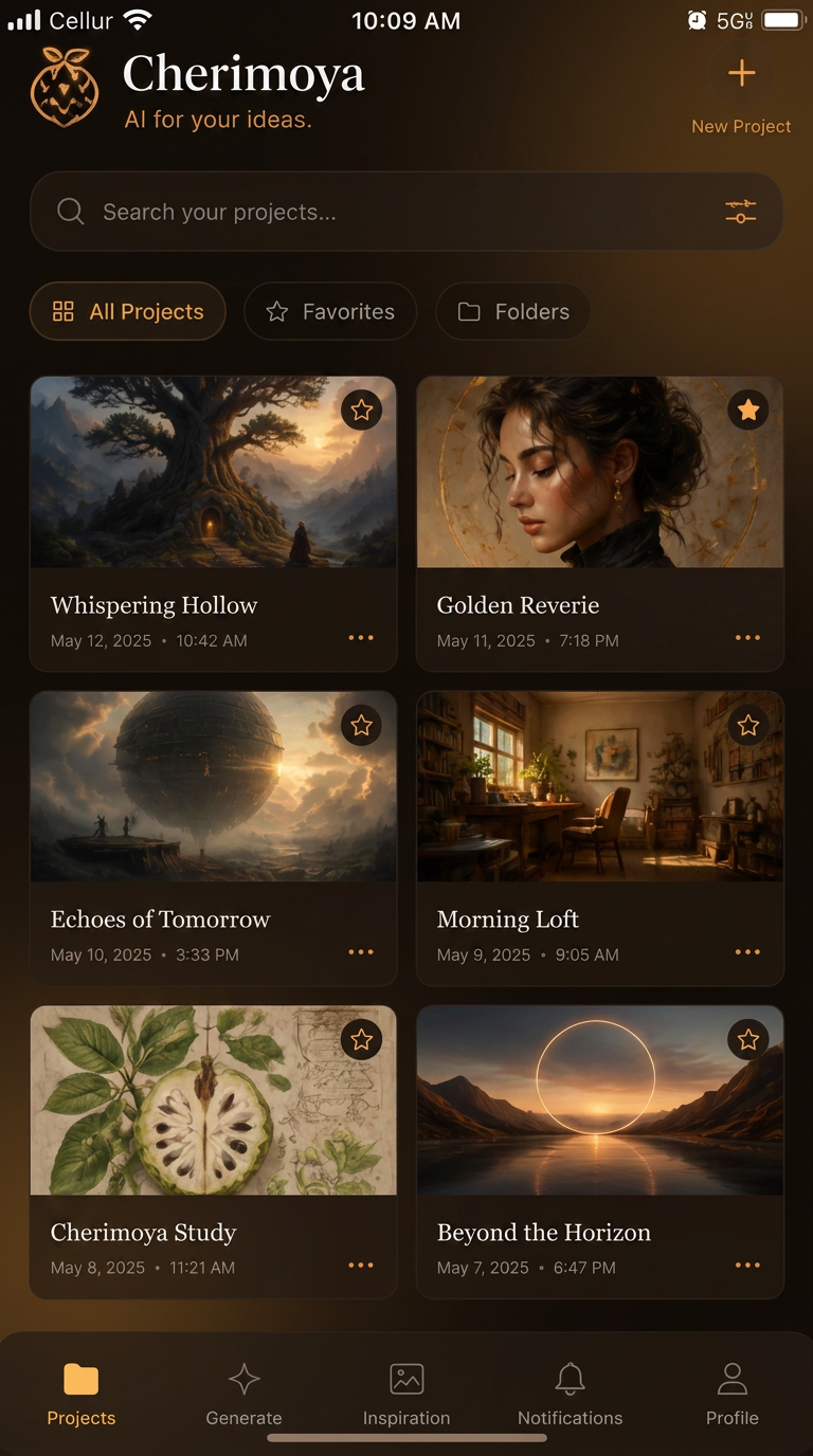
Library
Work is kept, searchable, and easy to return to.
Warm dark / amber light · Amber on clay dark · Phone frame · 9:19.5
Kiwano
Travel · Warm glass / photographic
Frosted panels over photography with warm cream light — travel as anticipation rather than logistics.
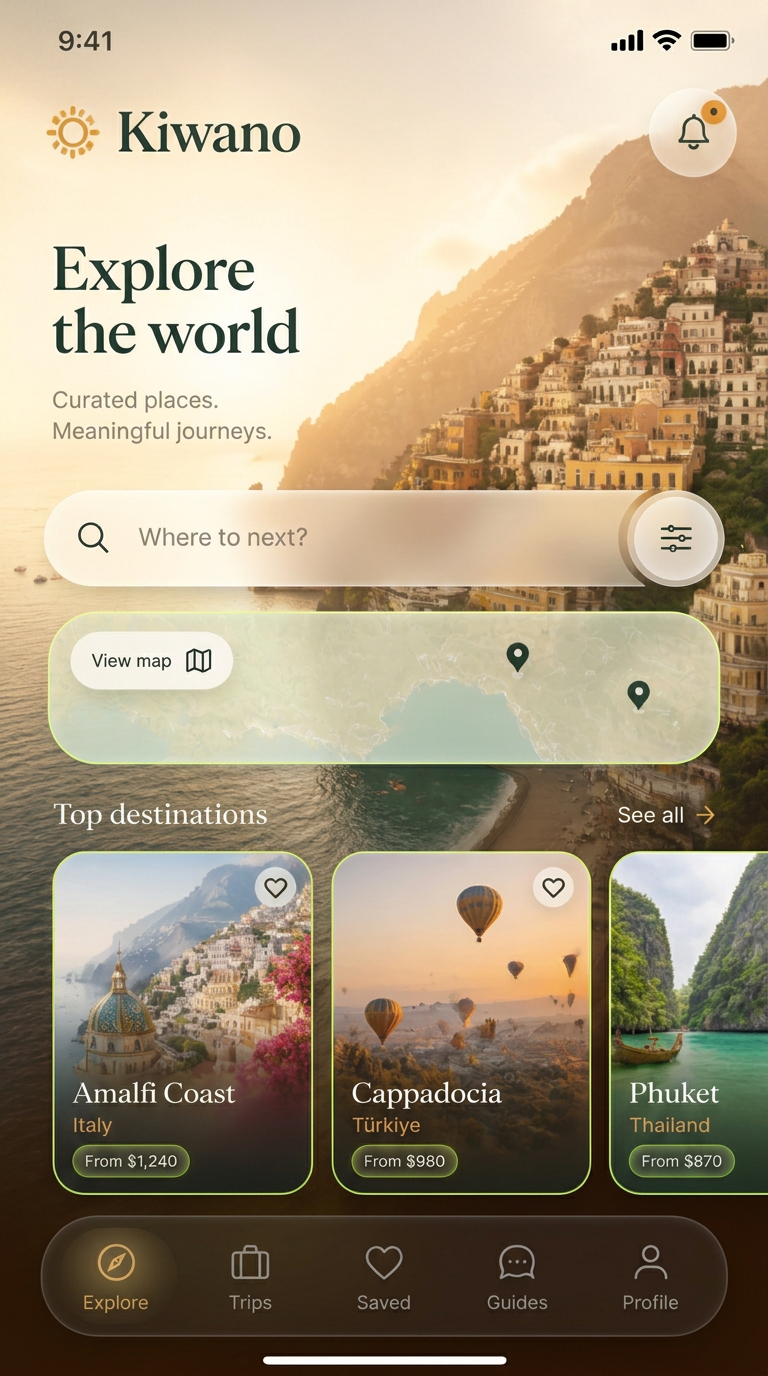
Explore
Search, map, then destinations — in the order curiosity moves.
Warm glass / photographic · Warm clay · Phone frame · 9:19.5
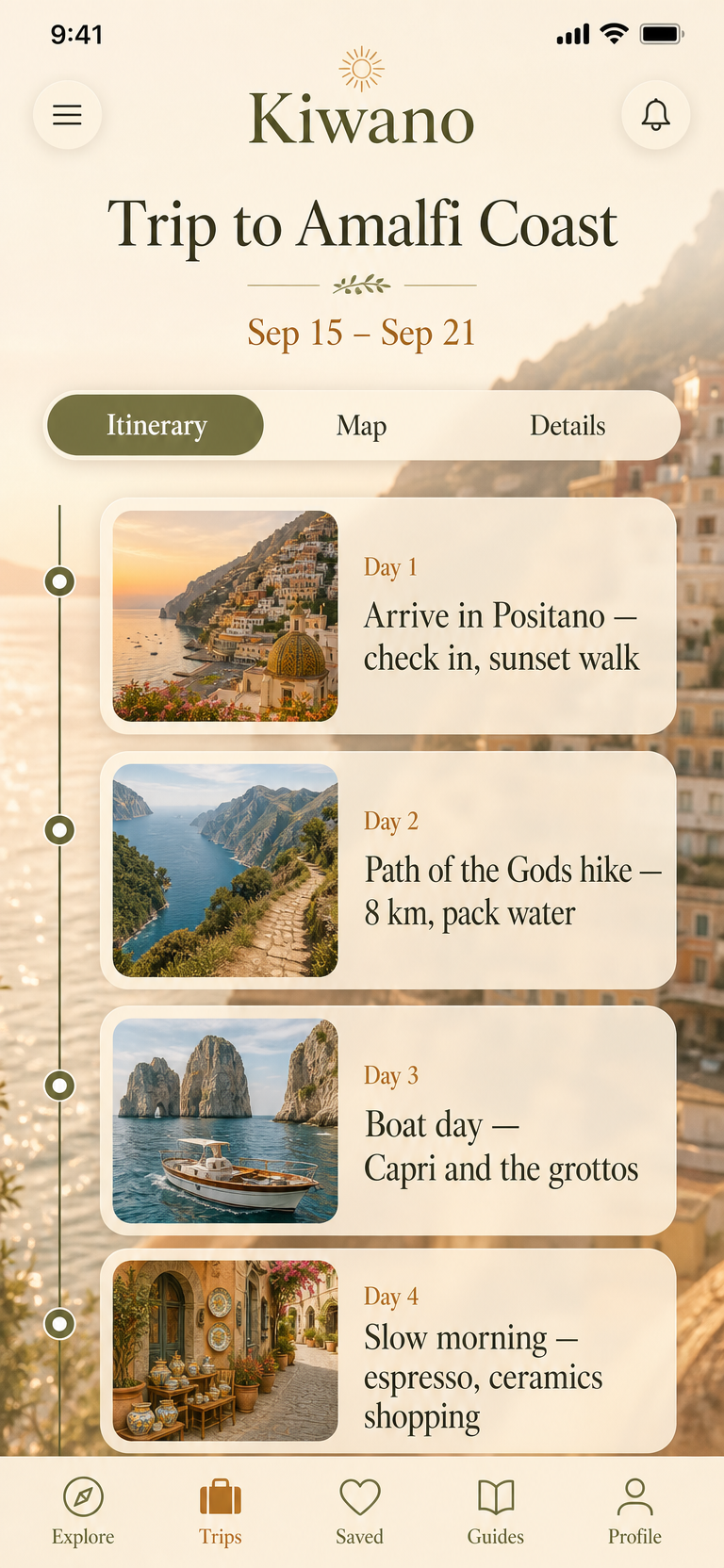
Trip
A day at a time, so a plan reads like a story.
Warm glass / photographic · Warm clay · Phone frame · 9:19.5
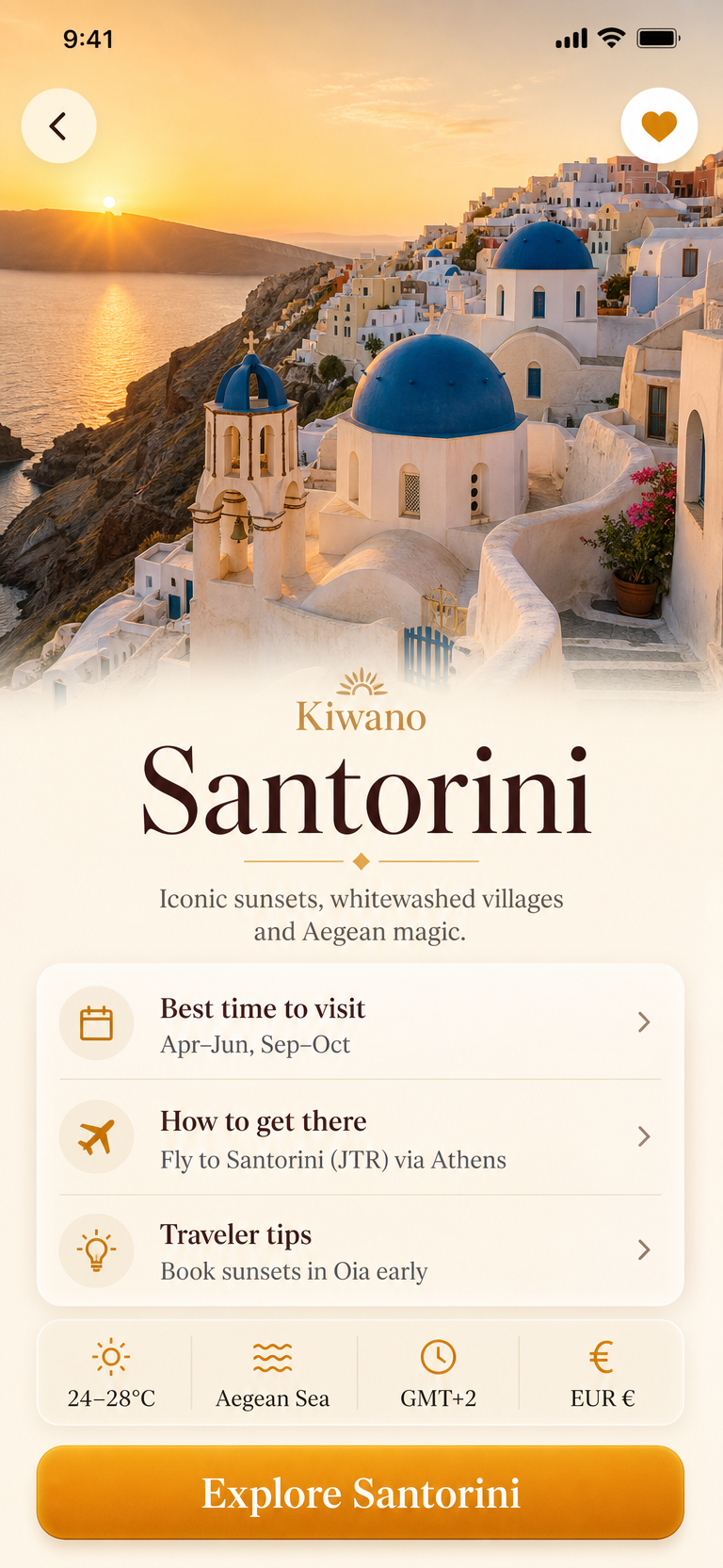
Destination
Photograph first; the practical detail sits under it.
Warm glass / photographic · Warm clay · Phone frame · 9:19.5
02 — SaaS studies — five products
Five B2B products, three screens each: Salak, Langsat, Ackee, Jabuticaba and Lucuma. Forest-green mixed media, Swiss print analytics, warm glass, cool steel-blue calm and blueprint ink — each set covers the overview a manager opens, the surface a team lives in, and the screen where something gets committed.
Salak
AI operations · Mixed media — pencil sketch under UI
Crisp product surfaces composited over the sketchbook they came from: graph paper, pencil wireframes, forest-green ink.
Open working prototype →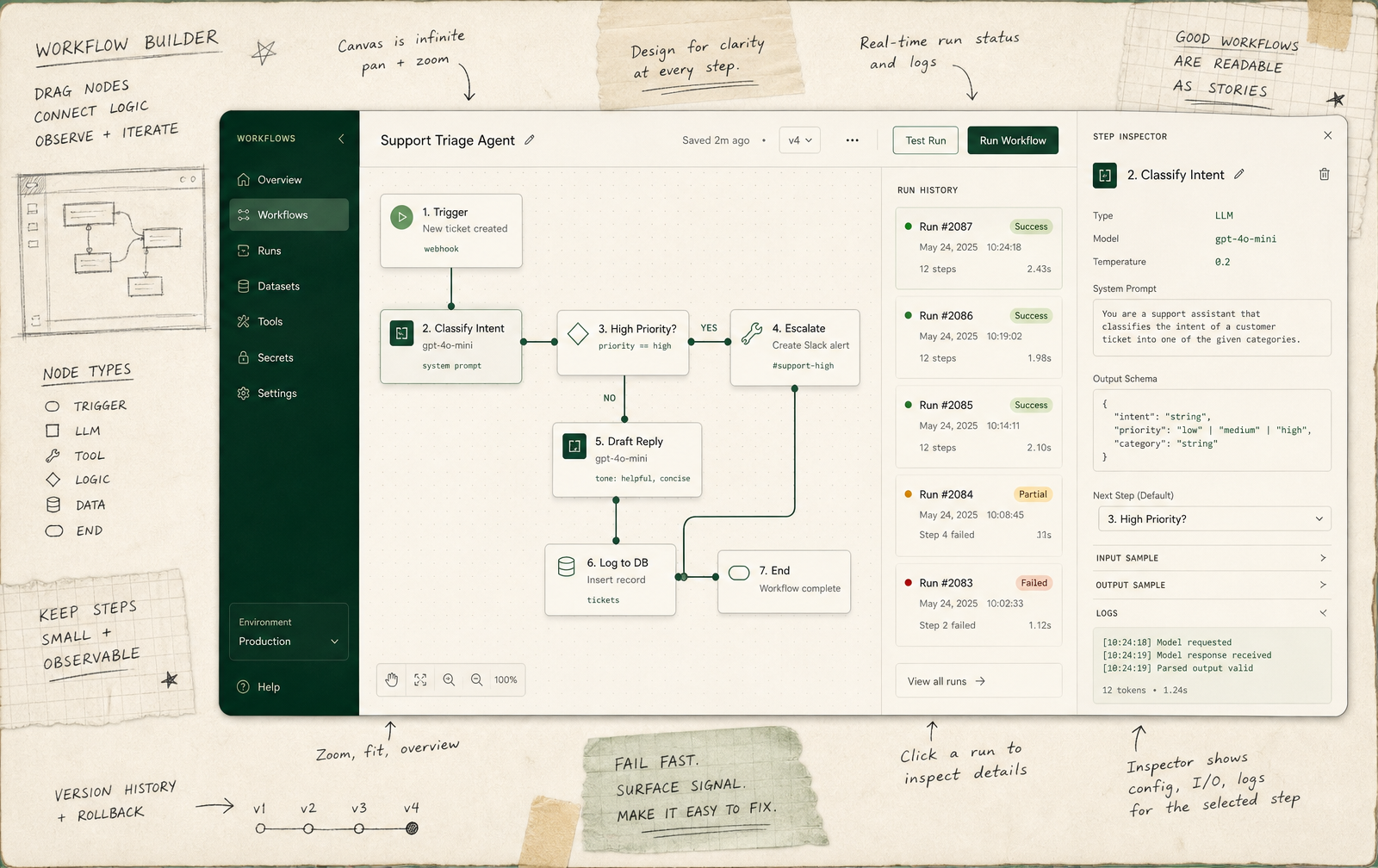
Workflow builder
The drawing kept next to the build — the thinking stays visible.
Mixed media — pencil sketch under UI · Forest green · Desktop 1600×1008
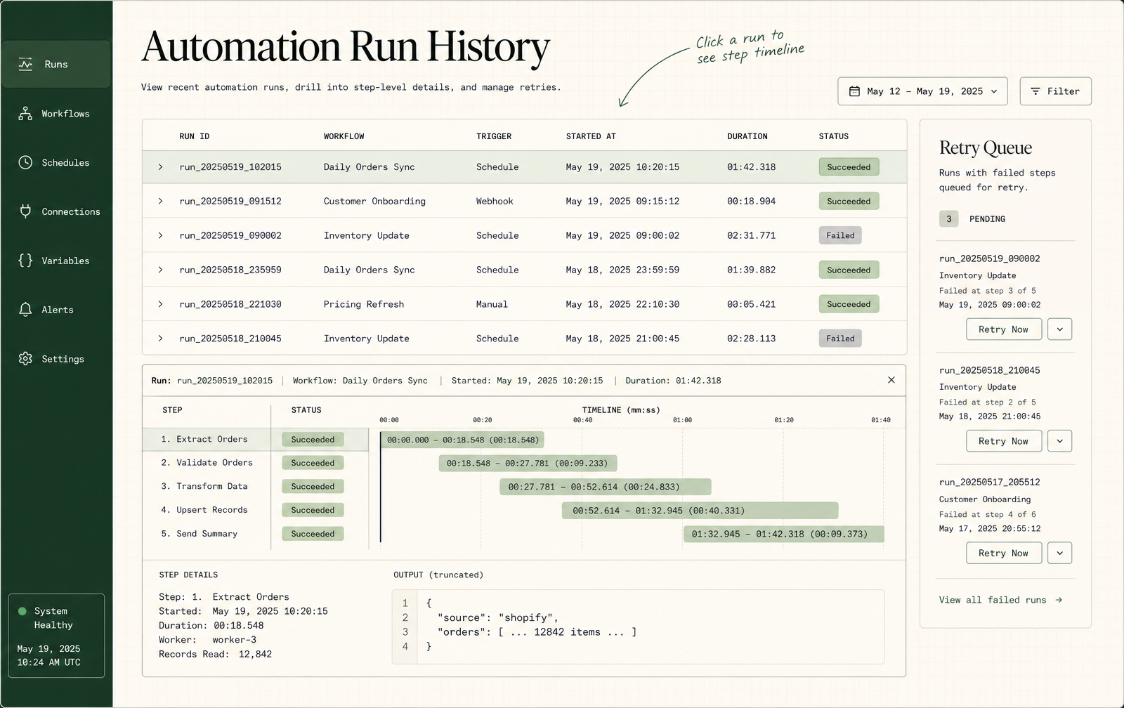
Run history
Every run legible after the fact: status, duration, cost.
Mixed media — pencil sketch under UI · Forest green · Desktop 1600×1008
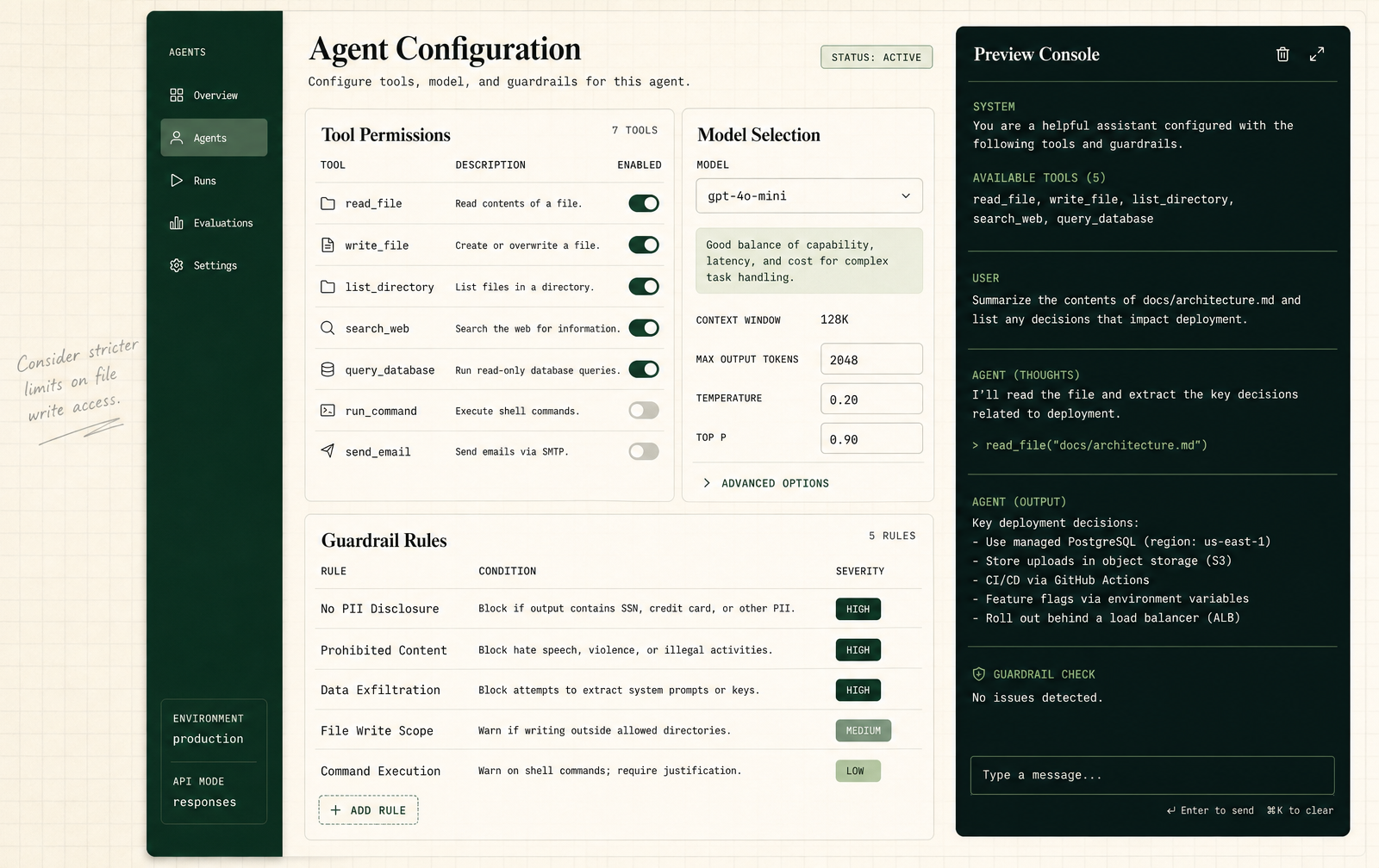
Agent config
Configuration annotated by hand where a rule needs a reason.
Mixed media — pencil sketch under UI · Forest green · Desktop 1600×1008
Langsat
WIPProduct analytics · Swiss print / graph paper · In progress
Bone-white and forest green, hairline rules and tabular monospace numbers — analytics set like a printed report rather than a control room.
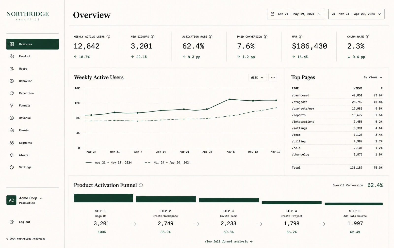
Overview
Six numbers, one trend, one funnel — the meeting-opening screen.
Swiss print / graph paper · Forest green on bone · Desktop 1600×1008
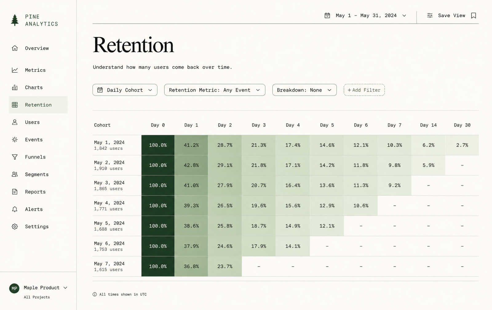
Retention
Colour carries the pattern; the percentages stay readable.
Swiss print / graph paper · Forest green on bone · Desktop 1600×1008
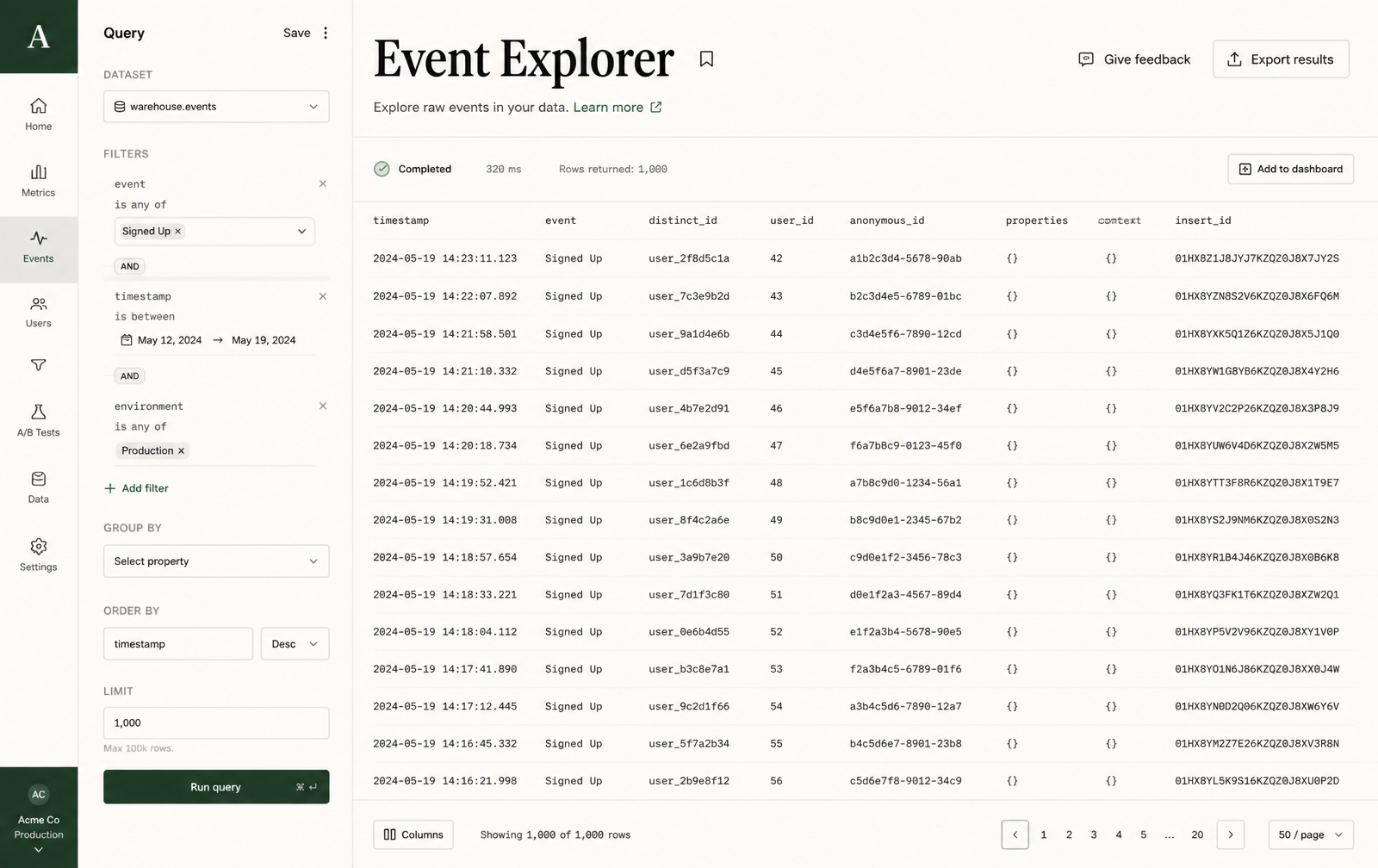
Event explorer
The raw table, one click from the chart that raised the question.
Swiss print / graph paper · Forest green on bone · Desktop 1600×1008
Ackee
Sales CRM · Warm glass / soft depth
Frosted panels on warm paper: a pipeline that reads as money, and a record that reads as a relationship.
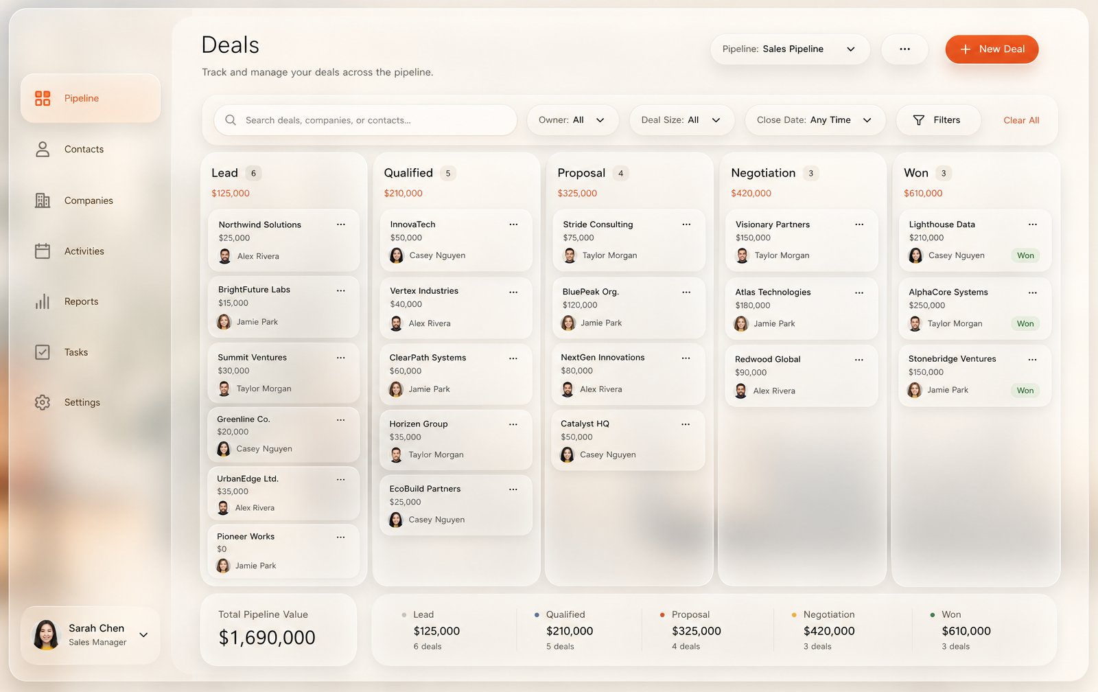
Pipeline
Stage totals in the column head so the board reads as money.
Warm glass / soft depth · Warm olive · Desktop 1600×1008
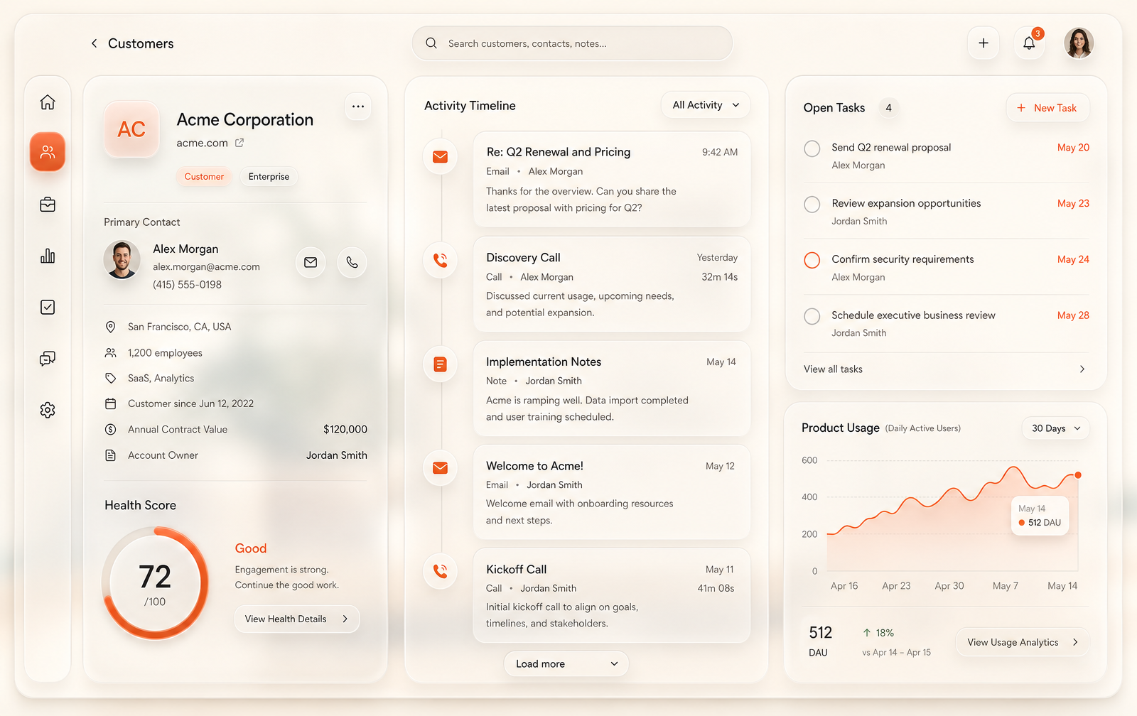
Customer
History as a timeline, next step pinned to the top.
Warm glass / soft depth · Warm olive · Desktop 1600×1008
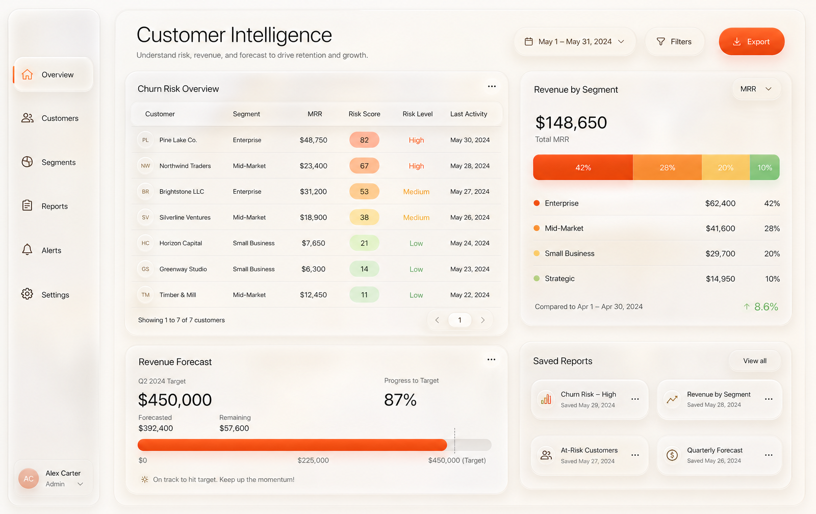
Churn risk
Risk ranked with the reason beside it, or nobody acts.
Warm glass / soft depth · Warm olive · Desktop 1600×1008
Jabuticaba
WIPBilling · Cool white / steel blue · In progress
Soft white with steel blue and generous whitespace — money screens that stay calm because nobody should feel rushed near an invoice.
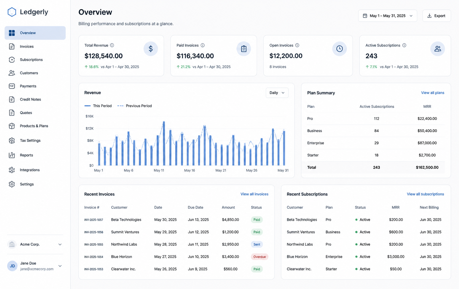
Overview
Revenue, open invoices and plan mix on one screen or none of them mean much.
Cool white / steel blue · Steel blue on white · Desktop 1600×1008
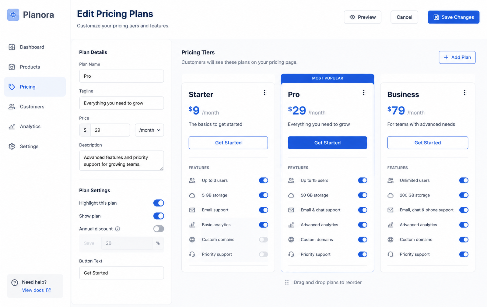
Pricing editor
Plans edited beside a live preview of what a customer will see.
Cool white / steel blue · Steel blue on white · Desktop 1600×1008
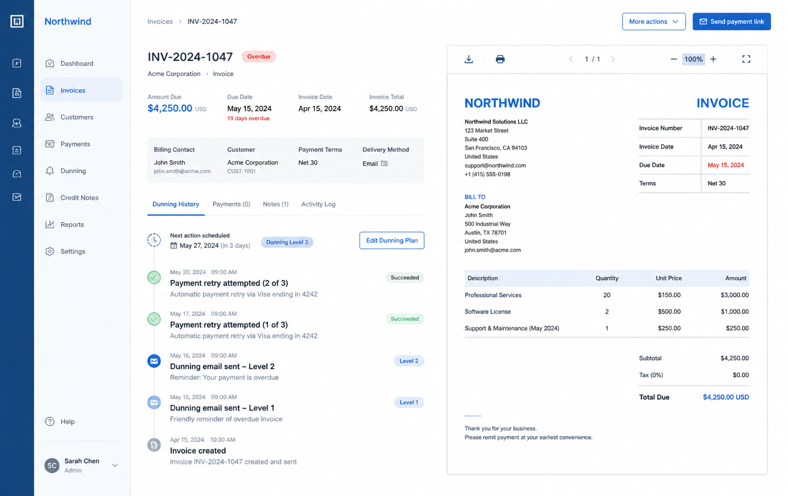
Recovery
A failed payment as a timeline with a next attempt, not a dead row.
Cool white / steel blue · Steel blue on white · Desktop 1600×1008
Lucuma
Developer console · Blueprint / ink annotation
Ink navy and teal on blueprint grid, annotated by hand: the trust surfaces of a platform — keys, requests, health.
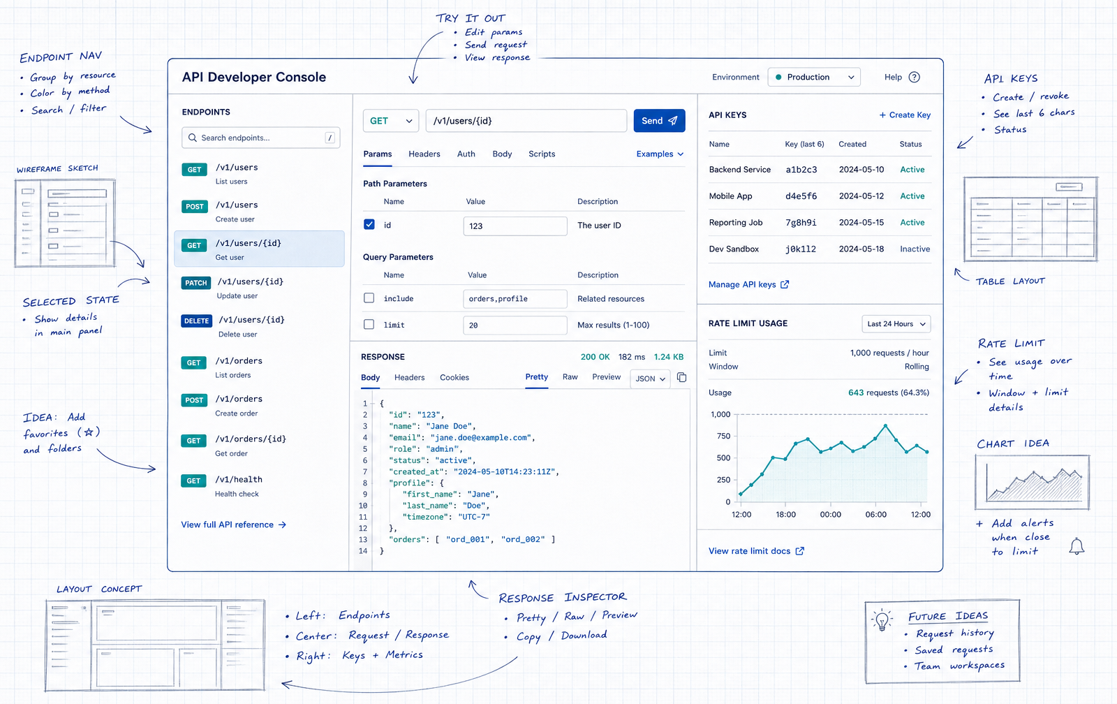
API console
Try the call in the place that documents it.
Blueprint / ink annotation · Ink navy + teal · Desktop 1600×1008
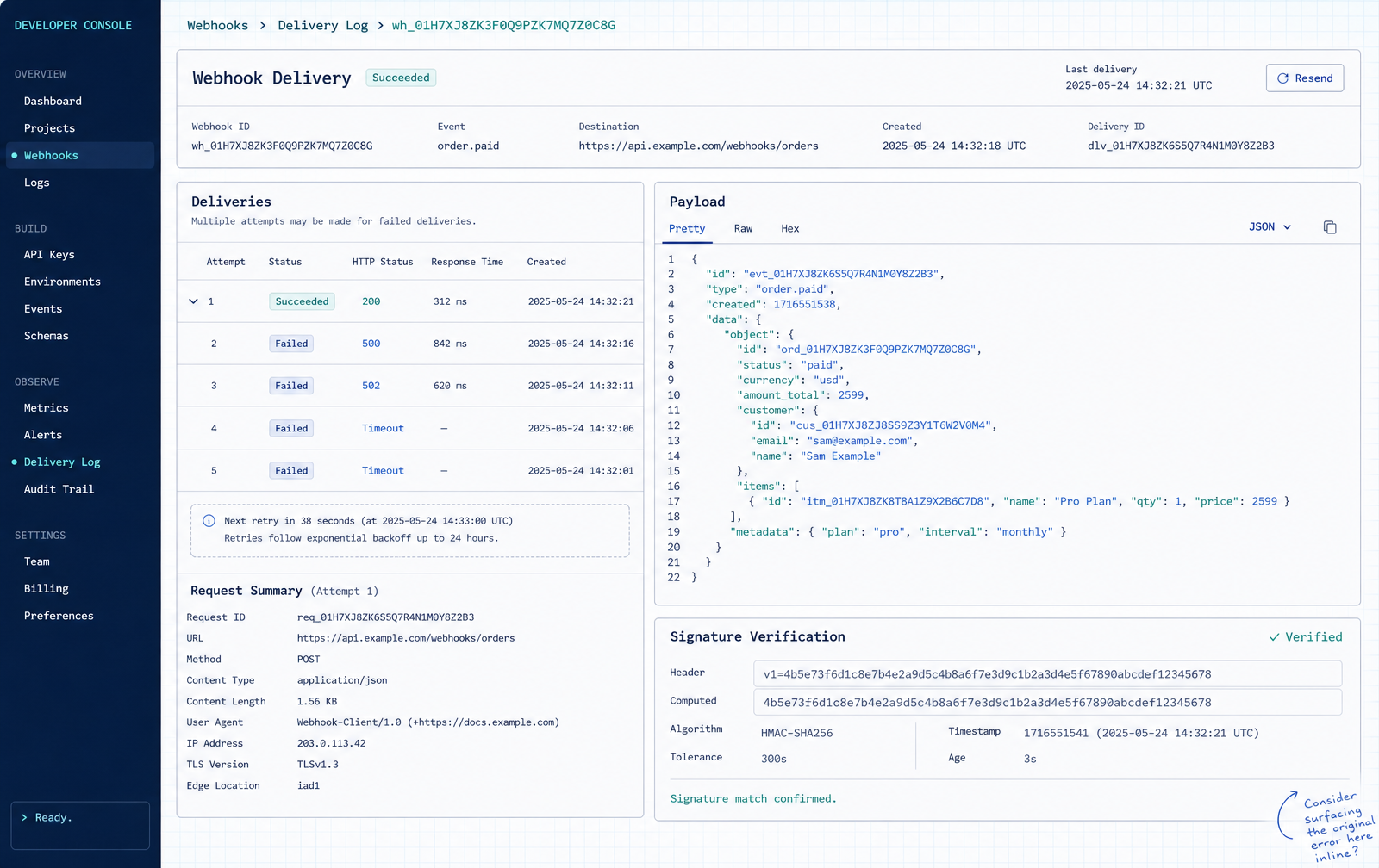
Logs
Monospace, filterable, with the payload one click away.
Blueprint / ink annotation · Ink navy + teal · Desktop 1600×1008
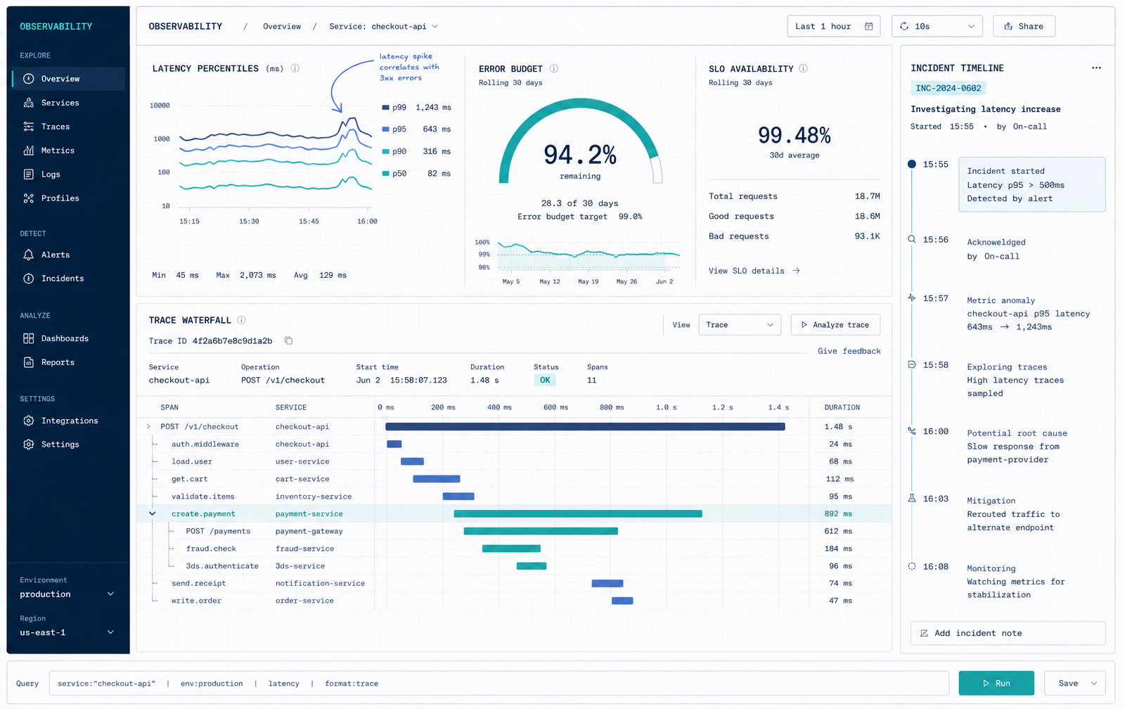
Observability
Latency and errors on one timeline, hand-annotated thresholds.
Blueprint / ink annotation · Ink navy + teal · Desktop 1600×1008
03 — Rendered concepts
The same flows taken to full fidelity in the visual language of the reference material — translucent surfaces, pill controls, soft depth — to test how the structure holds once material and light are added.
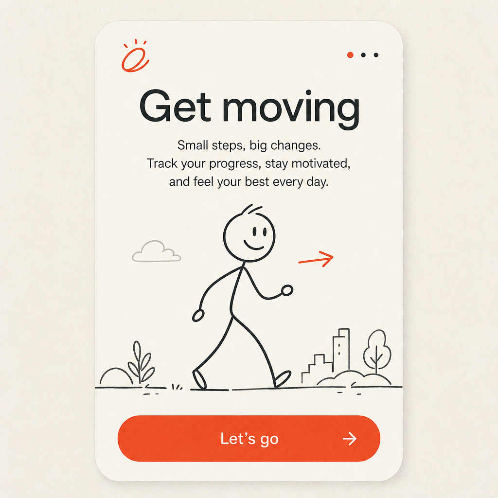
Onboarding — rendered
One promise, one action. The illustration carries the tone before the button asks for commitment.
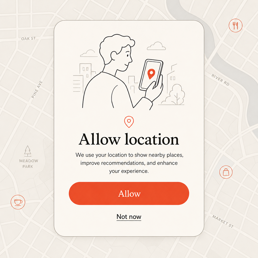
Permission ask — rendered
Explain the trade on the card; the map behind hints at what is gained without stealing focus.
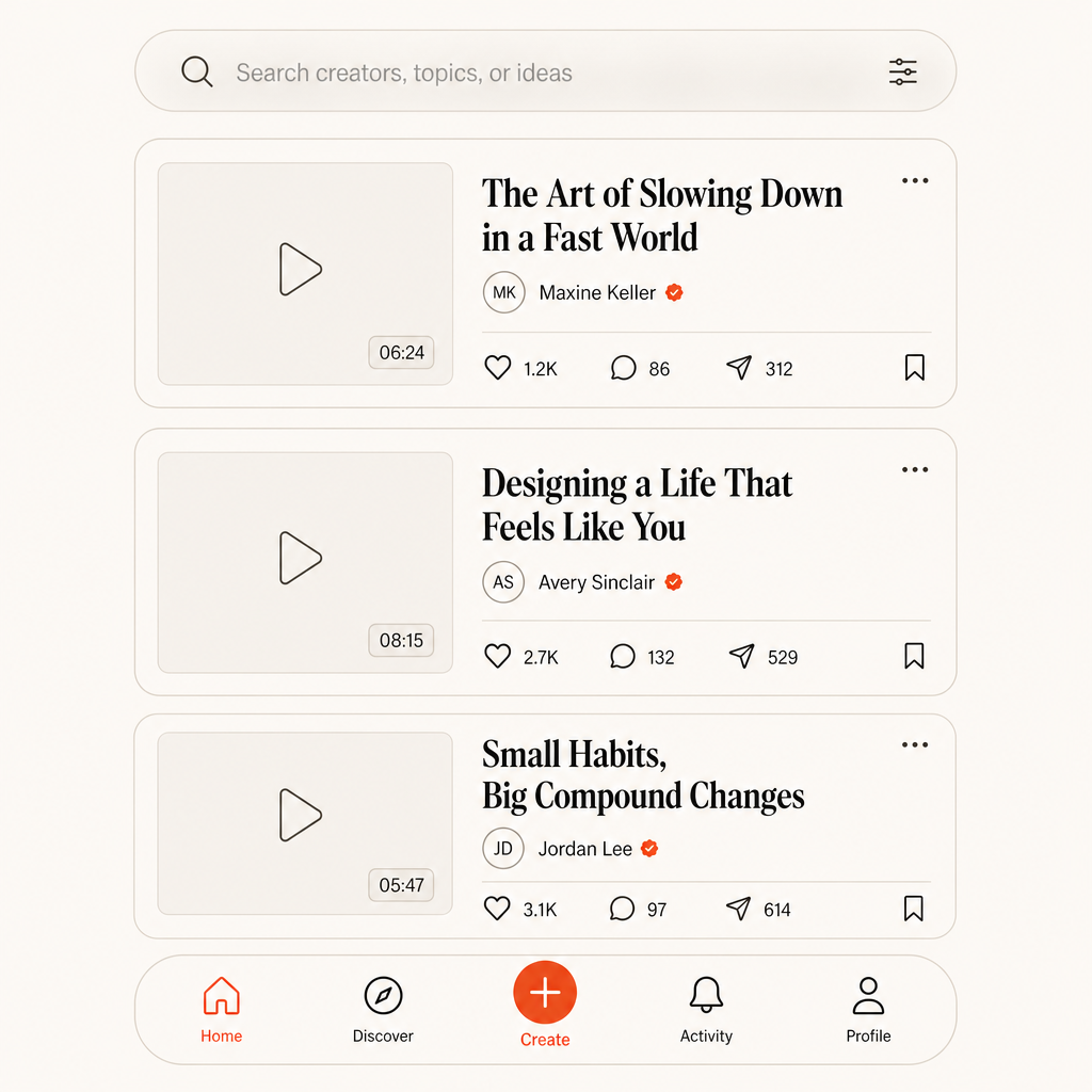
Feed — rendered
Scannable cards, quiet metadata, and a bottom bar where the create action is the only accent.
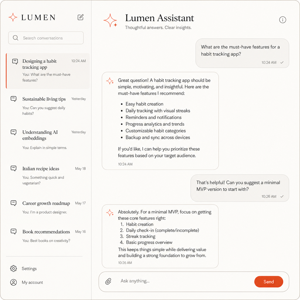
AI assistant — rendered
Conversation history on the left, the current thread in the centre, send as the only warm accent.
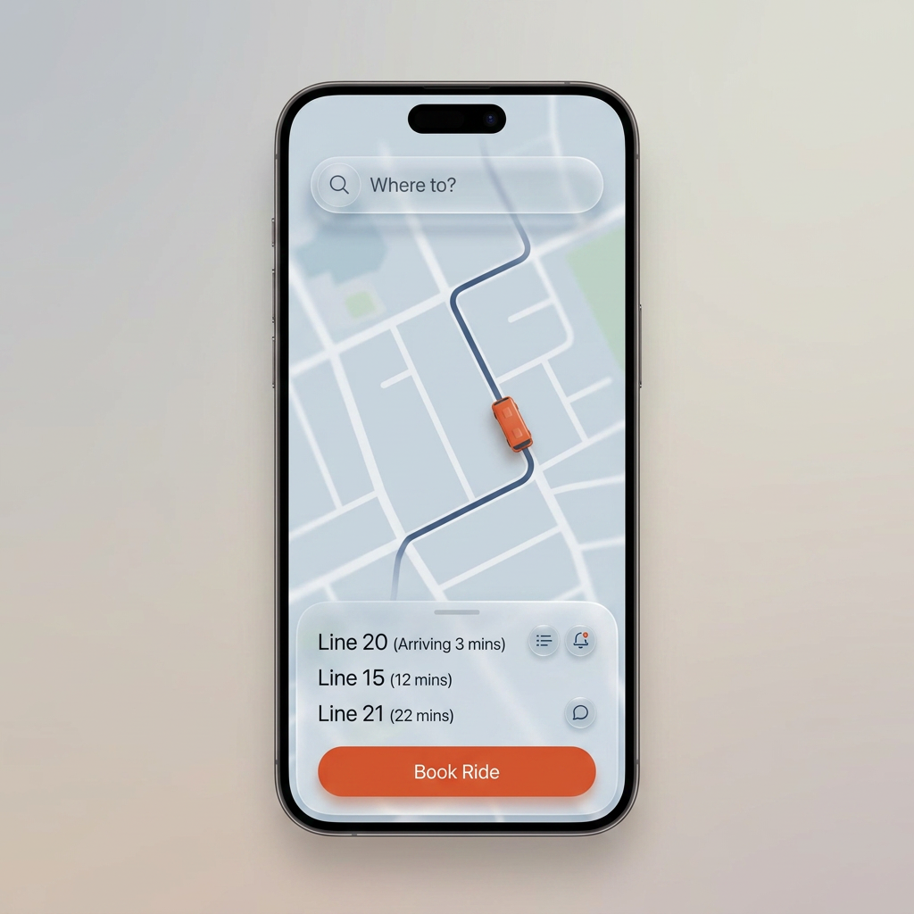
Live tracking — rendered
Map, route and arrivals sheet in frosted layers; one accent reserved for the commit action.
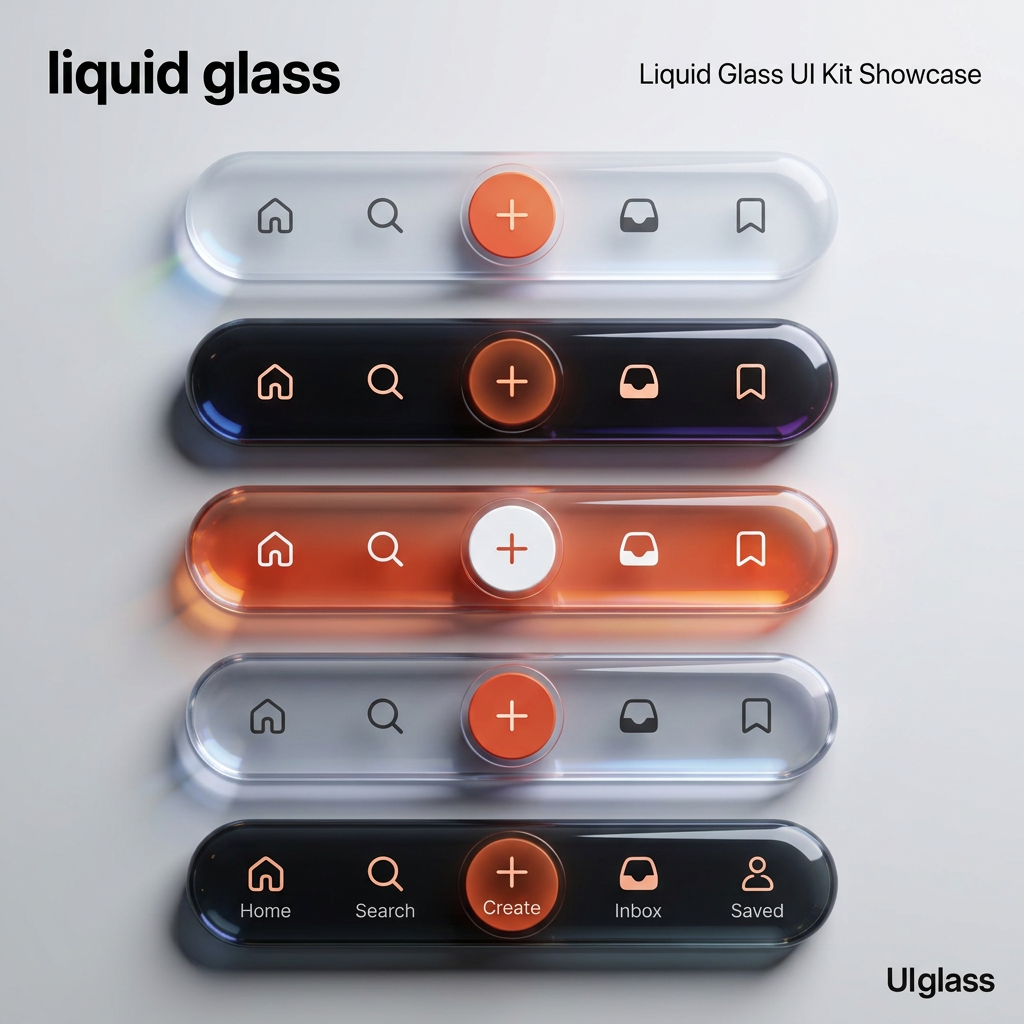
Pill nav — five treatments
Light, dark, accent-filled, icon-only and labelled — tested for legibility and how loud the create action gets.
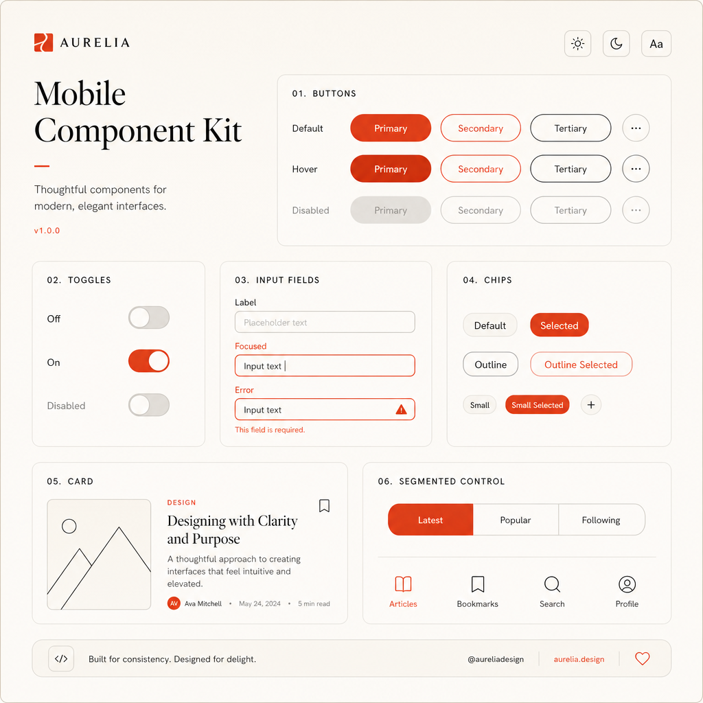
Component kit — rendered
Every state drawn before hand-off: default, hover, focus, disabled, selected.
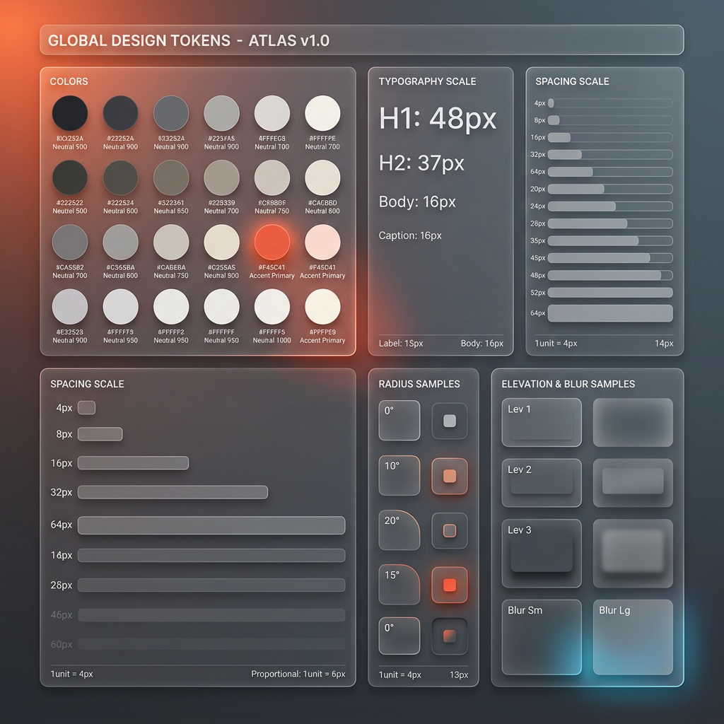
Token board
Colour, type, spacing, radii and elevation documented as one artefact so screens get assembled, not decorated.
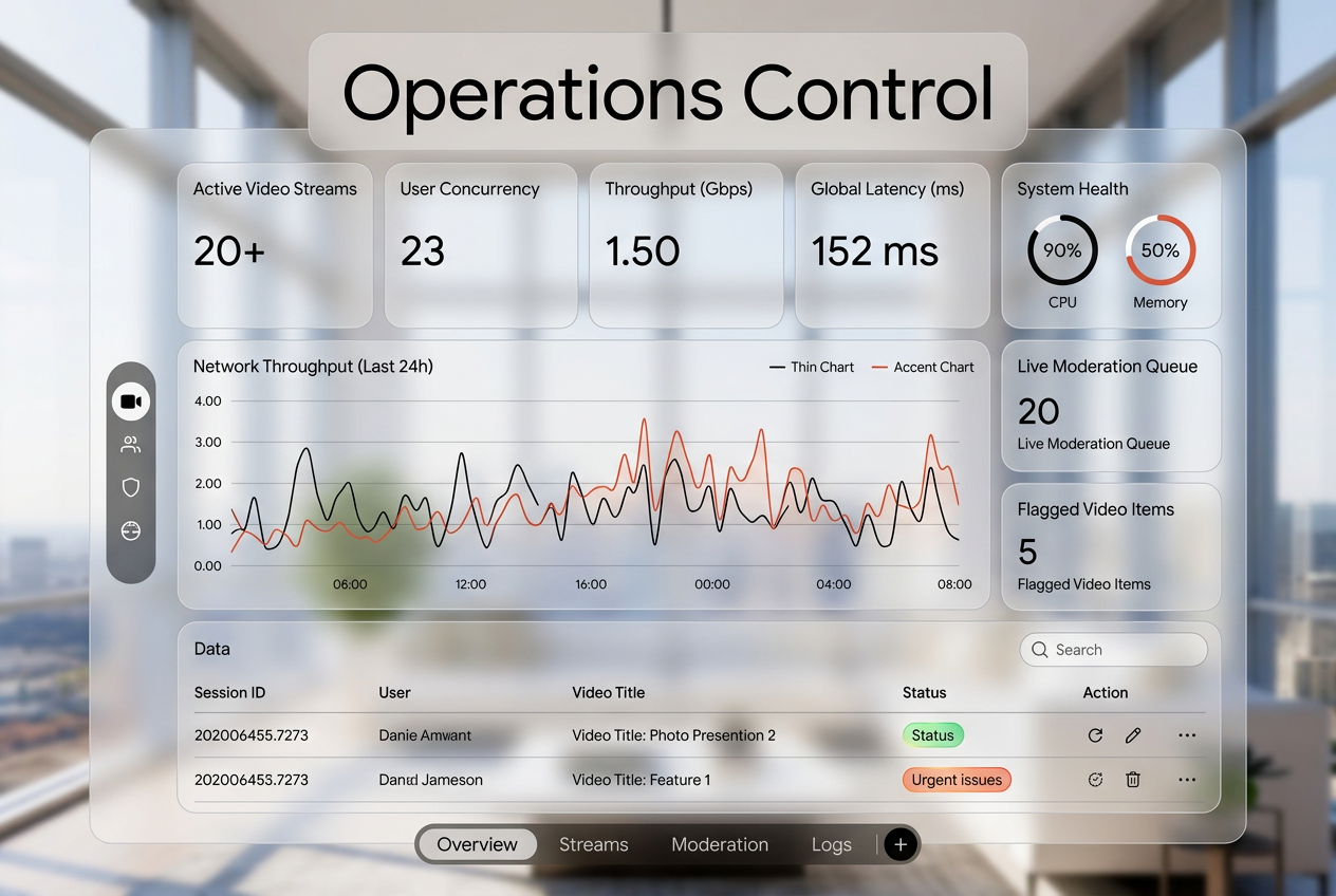
Operations dashboard — rendered
Metrics row, throughput chart, moderation queue and a table with status chips: density with a clear reading order.
04 — Mobile flow
A three-screen arc: welcome the person, orient them on a map, then hand them a list they can act on. Drawn as one set so type scale, spacing and the accent stay consistent across the flow.
Get moving
01 / Onboarding
One promise, one action. Nothing else competes.
02 / Discovery
Map first, controls docked low where thumbs live.
Arrivals
03 / Detail
Scannable rows, one live item emphasised.
05 — Live tracking & permissions
The two hardest screens in any location product: the one that has to feel alive, and the one that has to earn trust before anything works.
Arriving in 3 min
Tracking surface
Route, vehicle and a bottom sheet of arrivals — layered, not stacked.
Turn on live location
So we can show what is actually moving near you — nothing else.
Permission ask
Explain the trade before asking. The illustration carries the tone.
06 — Navigation studies
One pill nav in three treatments — paper, accent and ink — tested for contrast, label legibility and how much attention the create action deserves.
Three treatments
Same geometry, three levels of assertiveness.
Placement study
Where the bar sits changes what people reach for first.
07 — Design system
Tokens and components drawn together, so a screen can be assembled instead of decorated. Every state is drawn — default, hover, focus, disabled — before hand-off.
Type scale
H1
H2
Body
Spacing
Stroke & radius
States
Tokens
Type scale, spacing, rules and the single accent.
Button
Chip
Toggle
Field
Component kit
Buttons, chips, toggles and fields, in every state.
08 — Operations surfaces
The screens users never see. A dense control room for moderation and throughput, and a dashboard schematic for the metrics a team actually watches.
Live sessions
● streamingQueue
1.4k
concurrentControl room
Live sessions, queues and status — density earned, not decorative.
Pipeline
25
releases7
peopleDashboard schematic
Few numbers, clearly ranked. The rest is on request.
Changelog — built vs planned
What is finished on this page, and what is still queued. Studies marked WIP are shown deliberately — the revision is part of the work.
Built
- Six finished studies: Salak, Ackee, Lucuma, Mangosteen, Feijoa, Kiwano
- Phone frames locked to iPhone 16 proportions (9:19.5); desktop frames to 1600×1008
- Per-project palette, type pairing and medium labels under every caption
- Horizontal project rail with tap-to-jump navigation
- Rendered concept set: onboarding, permission, feed, AI assistant
- Line-drawn studies and token boards behind the rendered screens
Planned / in progress
- Rambutan — risograph feed and create screens being redrawn
- Cherimoya — warm-dark AI surfaces still in revision
- Langsat — Swiss print analytics set awaiting final pass
- Jabuticaba — condensed display billing set awaiting final pass
- Motion notes per study (what animates, and why)
- Short decision write-up attached to each study